If you’re already comfortable with creating presentations in Microsoft PowerPoint, you may be surprised at how simple it is to use your skills to develop other polished, professional–and engaging–visuals that look as great as ones designed in more complex software like Adobe InDesign. Forget long blocks of copy (at least sometimes) and embrace infographics, brochures, flyers, and more.
Why Microsoft PowerPoint?
What sets PowerPoint apart is its accessibility and flexibility. Almost everyone has it, but few realize how effective it can truly be. While Adobe InDesign is often the first choice for professional designers, working in PowerPoint can produce just as impressive results.
Think about this: In PowerPoint, you can craft custom layouts, manipulate text, and play around with fun graphics. There is even a design assistant to provide fresh layout ideas! These capabilities allow you to create marketing materials that look like they were generated in more advanced design software–but with familiar tools you already know how to use.
The Foundation: Setting up Your Document
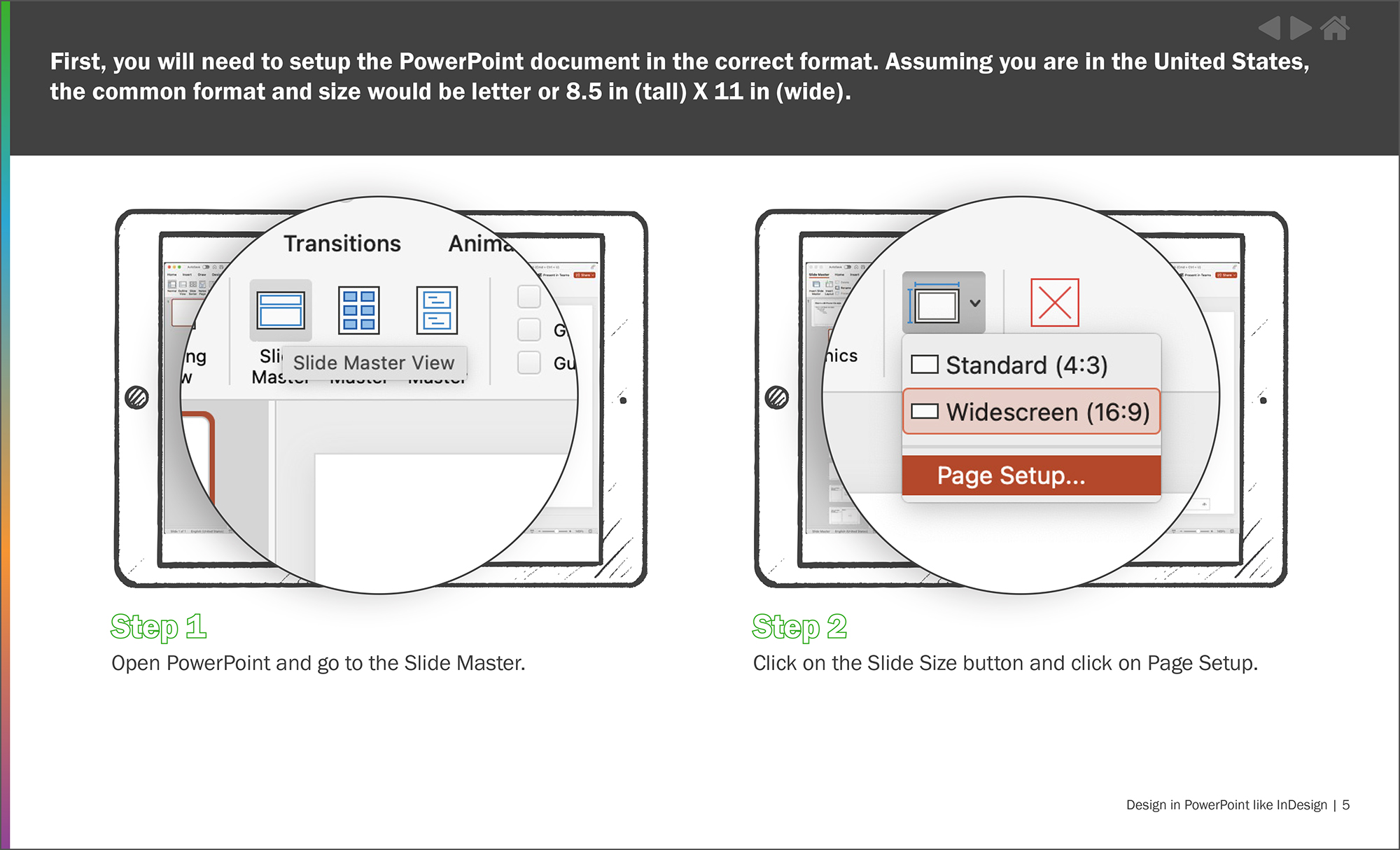
Step one in using PowerPoint as your new go-to design tool is formatting. You’ll want to start with a standard size of 8.5 x 11 inches for most presentations. PowerPoint makes this super easy. As shown in Figure 1, start with the Slide Master and select a size.
Laying this solid foundation for your project and properly organizing the document sets you up to focus on creativity instead of dealing with layout issues later.
Customize Your Design: Colors and Fonts
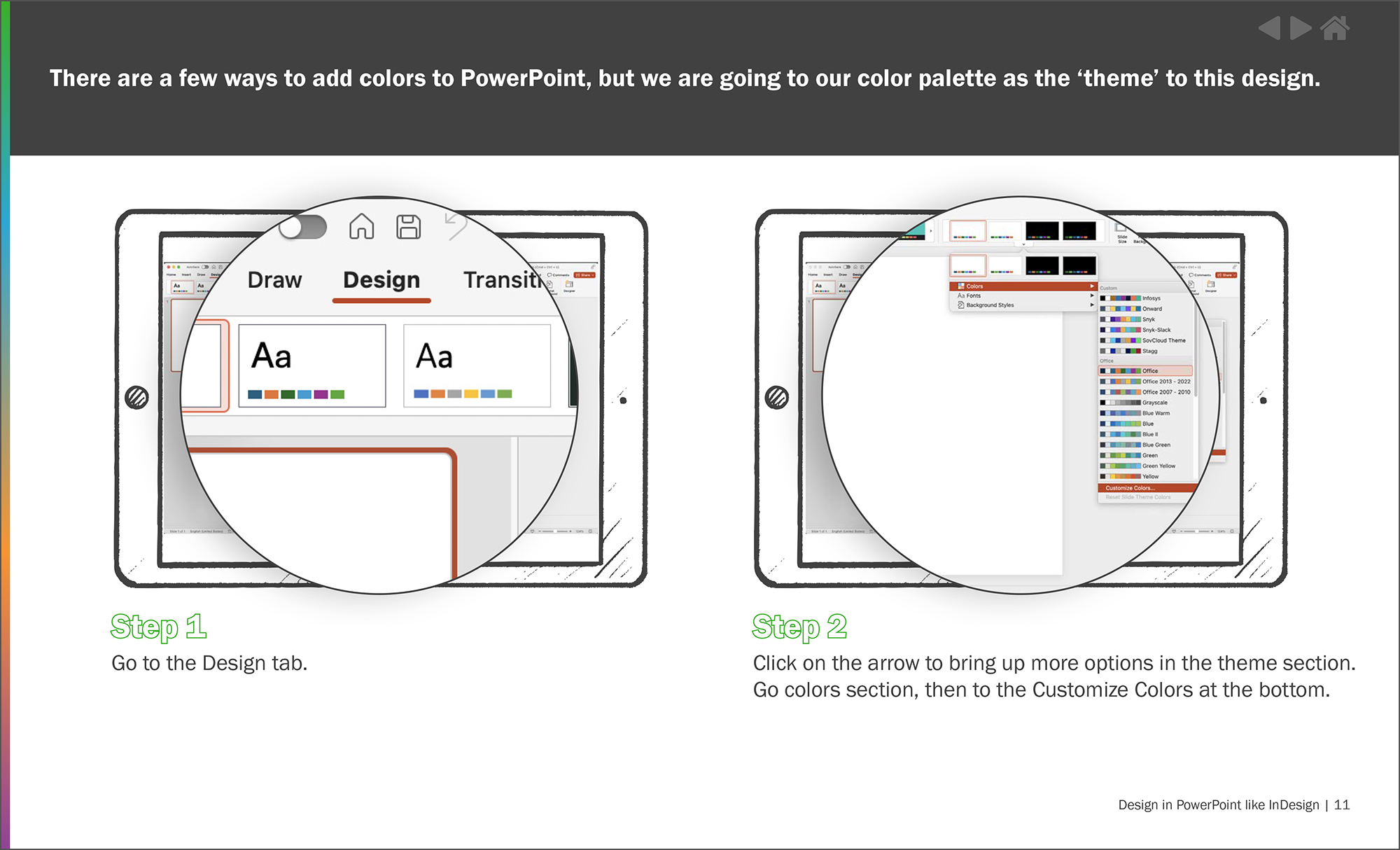
Design time! PowerPoint offers many tools that can make your content pop. Let’s start with the fundamentals: colors and fonts. Using on-brand colors and fonts is Marketing Design 101, and PowerPoint makes it very easy to stay consistent. You can store your color scheme and use it repeatedly to guarantee cohesion. The same goes for fonts, so they show correctly, regardless of where or how the design is shared.
Level up: Advanced Techniques
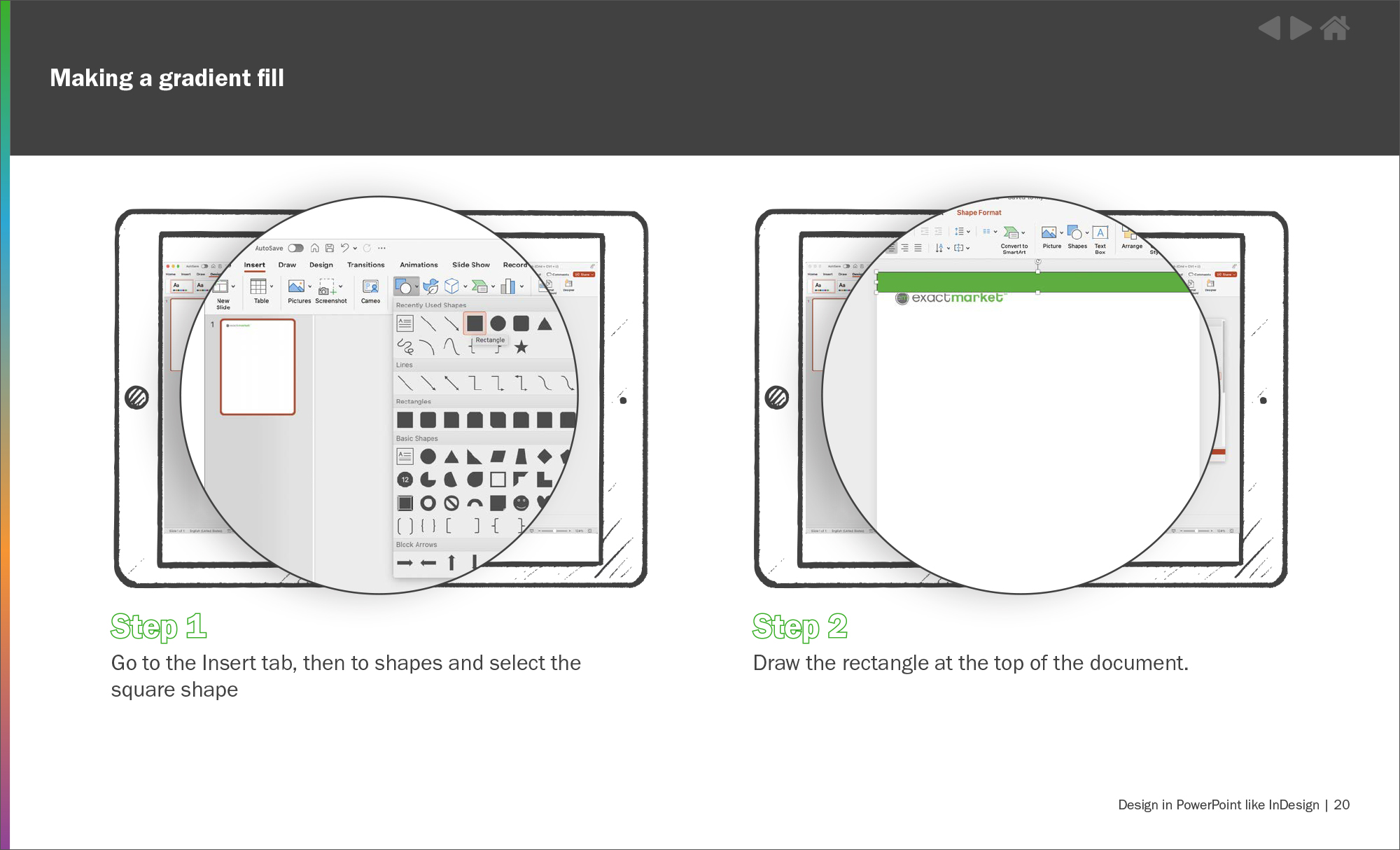
In PowerPoint, you can add artistry like gradients and drop shadows to your project. These elements often add texture and sophistication to a design. Gradients can form a dynamic, eye-catching effect. This is a common approach in high-end productivity software, but it’s easier to do in PowerPoint. Similarly, drop shadows can add a subtle three-dimensional feel to your text and images, enhancing their visual impact.
The Final Product: Finishing Touches
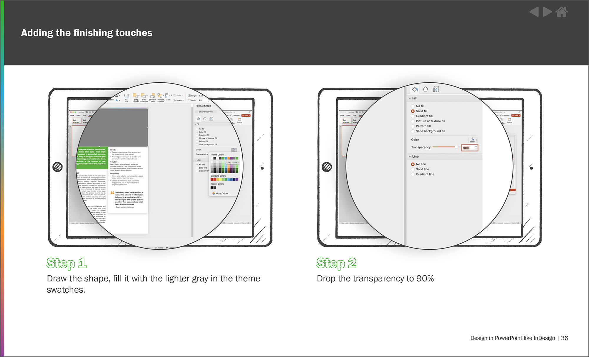
With your layout, text, and images in place, it’s time to add those final touches, elevating an average design to a truly outstanding one. Consider adding a footer or background color that ties together your design elements for that polished, professional look.
PowerPoint as Your Design Ally
PowerPoint might not be the first tool that comes to mind when creating that infographic or invitation. But with Exact Market’s guidance and your creativity, it can become your go-to design resource. You might be surprised by what you can create!
Download our Design in PowerPoint like InDesign Guide and start exploring.
